
Email accessibility is crucial for inclusive communication. It ensures that all users, including those with disabilities, can access content.
Designing emails for screen readers and dark mode is part of this effort. Emails should be readable by everyone. Many people use screen readers or prefer dark mode. These preferences impact how they interact with emails. Accessibility in emails means considering these needs.
It’s not just about compliance. It’s about respect and inclusion. This checklist will help you design emails that work for all users. It will guide you through key elements. From text alternatives to color contrast, you’ll learn essential tips. Let’s make email communication more inclusive together.
Quick Navigation
Introduction To Email Accessibility
Email accessibility ensures that all users can read and understand your messages. This includes individuals with disabilities. Designing emails with accessibility in mind is not just good practice. It’s a necessity. It helps you reach a wider audience. It makes your content more inclusive.
Importance Of Accessibility
Accessibility in emails is crucial for several reasons. It caters to users with visual impairments. It aids those who rely on screen readers. It also helps users who prefer dark mode. Ensuring your emails are accessible improves user experience. It shows you care about all your readers. It also aligns with legal requirements in many regions.
Benefits For Users
Accessible emails offer several benefits for users. They make content easier to read. They enhance comprehension. They ensure everyone can engage with your content. Screen reader users can navigate emails more easily. Those using dark mode will experience less eye strain. Accessible emails create a better overall experience for all users.

Credit: www.emailonacid.com
Designing For Screen Readers
Designing for screen readers ensures your emails are accessible to all users. Screen readers convert text to speech, allowing visually impaired users to understand your content. To create an inclusive experience, focus on text structure and alternative text. These elements make your emails more readable and enjoyable for everyone.
Text Structure
Organize your email content with clear headings and subheadings. This helps screen readers navigate the text easily. Use proper HTML tags like and for headings. Avoid using bold text to indicate headings. Screen readers do not recognize bold text as headings. Use short paragraphs and bullet points to break up long sections of text. This improves readability and helps users follow the content.
Alternative Text
Alternative text, or alt text, describes the content of images. Screen readers read this text aloud, helping visually impaired users understand the image. Write clear and concise alt text for all images. Avoid using “image of” or “picture of” in the description. Instead, describe the image directly. For example, “A smiling woman holding a coffee cup.” Use alt text to convey the purpose and context of the image within the email.
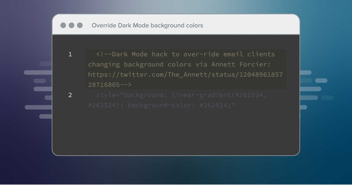
Optimizing For Dark Mode
Optimizing for dark mode improves email accessibility. Design emails that are easy to read in both light and dark modes. Ensure screen readers can interpret the content correctly.
Optimizing your emails for dark mode isn’t just a trend—it’s a necessity. More users are switching to dark mode to reduce eye strain and save battery life. But what does this mean for your email designs? It means you need to consider how your emails will look when the background is dark and the text is light. Here’s how you can make sure your emails are visually appealing and accessible in dark mode.
Color Contrast
First things first, let’s talk color contrast. In dark mode, your usual color choices may not work well. You need to ensure the text is readable against a dark background.
High contrast is key. Use light text colors like white or light gray for your main content. Avoid using colors that blend into the background.
Test your emails in dark mode to see if the text stands out. This small step can make a big difference in readability.
Image Adjustments
Now, let’s move on to images. Images can look different in dark mode. Some may appear too bright or have background colors that clash with dark mode settings.
Consider using transparent backgrounds for your images. This helps them blend seamlessly with any background color.
Also, think about adding a slight dark overlay to images. This makes them easier on the eyes when viewed in dark mode.
Remember to test how your images look in both light and dark modes. This ensures your email design is consistent and accessible to all users.
By making these adjustments, you can create emails that are not only visually appealing but also accessible to everyone. Are you ready to make your emails dark mode-friendly? Start optimizing today!
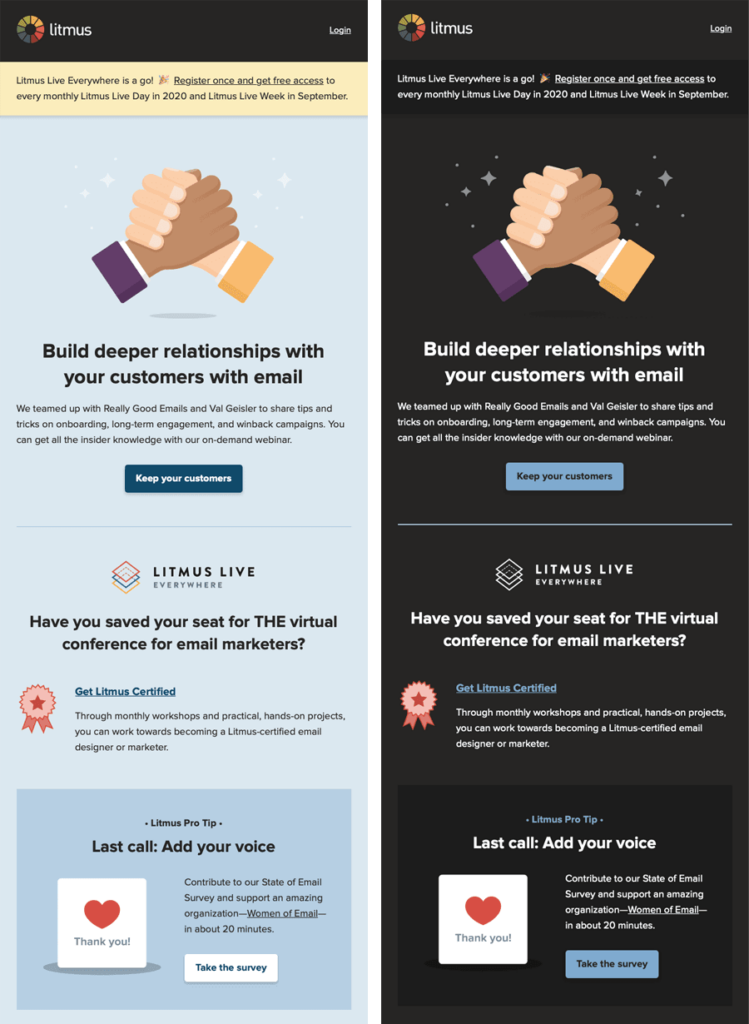
Credit: www.litmus.com
Testing And Validation
Ensuring your email designs are accessible involves thorough testing and validation. This process helps identify any issues that might hinder the email’s readability. By focusing on screen readers and dark mode, you can make your emails more inclusive. Testing and validation are crucial steps in this journey.
Accessibility Tools
Accessibility tools play a vital role in testing. These tools help detect potential accessibility problems. For screen readers, tools like JAWS and NVDA are popular choices. They read out the email content to simulate the experience of visually impaired users.
For dark mode, email clients like Outlook and Gmail offer built-in testing options. Tools like Litmus and Email on Acid provide comprehensive testing environments. These tools help ensure your emails render correctly in dark mode.
User Feedback
User feedback is invaluable for accessibility validation. Real users provide insights that tools may miss. Gather feedback from users who rely on screen readers. Their experiences highlight areas needing improvement.
Similarly, ask users who prefer dark mode for their input. They can point out visibility issues or design flaws. This feedback helps refine your email design for better accessibility.
Credit: www.litmus.com
Conclusion
Creating accessible emails benefits everyone. Screen readers and dark mode enhance user experience. Implementing these tips ensures inclusivity. Clear text, proper structure, and thoughtful design matter. Small changes make a big impact. Aim for readability and accessibility. Keep testing and improving.
Your audience will appreciate the effort. Let’s make the digital world accessible for all.